The story of our logo
From napkin sketches to global recognition - this is how our logo came into being.
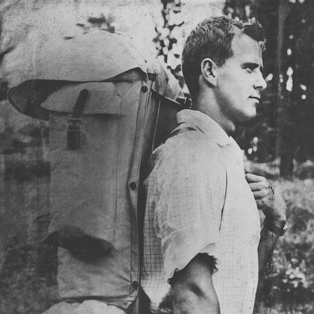
The Fjällräven logo – as you know it today – wasn’t in place in 1960 when Fjällräven founder, Åke Nordin, started selling his first backpacks. At that point the ‘logo’ was more of an illustration: a drawing of a fox running down a hill. But during one of Åke’s regular visits to Friluftsmagasinet (now Naturkompaniet) – the Stockholm store that sold Åke’s first products – a logo began taking shape.
Together with Friluftsmagasinet’s store manager Erland Westerberg and marketing manager, Nils Hillman, Åke began brainstorming and scribbling ideas of wrinkled napkins in the store’s cramped staff kitchen.
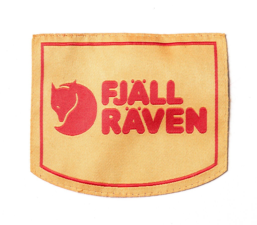
Those early sketches were sent to graphic designer Kjell Olsson, who developed the final design. They were under a bit of pressure to get the logo ready - Friluftsmagasinet’s product catalogue was about to go to print. But that managed to do it. And the curled up Arctic fox was born – a logo that would one day gain global recognition. They all agreed that a good logo should be clear and concise, usable in all formats and sizes, and tightly framed to avoid taking up unnecessary space. The more sketches they made, the more minimal the fox became. In the end, only the head and tail remained.
For the Fjällräven name, the trio settled on the Frankfurter font. Olsson felt that the round, soft block letters matched the logo “in a highly agreeable way”. But who was the brain behind the fox’s characteristic winking eye? On this matter, opinions differ.
Hillman claims it was his idea and is supported by Olsson. Åke, would insist it was he who gave the coiled fox its cunning look. Whatever the truth, the logo has enjoyed rare success.
In 2009 Fjällräven won the prestigious Signumpriset, an annual award made to the Nordic company judged to have best fostered its brand. Past winners include Volvo, Bang & Olufsen, Carlsberg and Absolut Vodka. The Signumpriset jury said Fjällräven had demonstrated how a strong brand identity can drive a company’s success over a period of many years, praising Fjällräven for its loyalty to the Arctic fox logo and for resisting the temptation to modernise it.
The curled-up Arctic fox with a glint in its eye is a logo that can now be seen on big city streets as well as in the woods and wilds. Market research suggests that 95% of Swedes recognise it and relate to it. For graphic designer Kjell Olsson, the Arctic fox was just one of numerous assignments allied to the production of Friluftsmagasinet’s product catalogue. It never occurred to him to charge Åke for the hours he spent on the logo, yet the Arctic fox is by far the most successful logo he would design during his career.
Olsson’s and Hillman’s creation is so functional and timeless that it never occurred to Åke to modify or replace it. Until recently. After 50 years of intensive use, the graphic identity needed to be carefully restored and updated, mainly so that it would work in digital formats. Font designer Göran Söderström at Letters of Sweden was commissioned to create a new unique Fjällräven typeface. The new font, Arctic Fox, protected the legacy of the Frankfurter font and the Arctic fox logo, while meeting new requirements for versatility and legibility.
But these are just small tweaks. The same cunning fox with its winking eye remains the same. And that’s something we’ll never change.